Last Updated on Feb 25, 2020 by James W
Do you know what stands between you and a great business proposal? Do not scratch your head; it is the “Contact Form??? but sadly enough it rarely gets your attention. It is frustrating to see that people are spending thousands of dollars on making their website look great and to make it conversion oriented, but when it comes to the Contact Form itself, they are blissfully ignorant of its importance. But an easy to use “Contact Form??? can make all the difference between a struggling business and an uber successful one. So, if you wish to see a steady increase in the number of business leads via your Contact Form, you need to follow the few tips mentioned here in this article:

Few Means More: Keeping something simple is harder than you may think. This is the reason why most designers fumble when it comes to designing a simple Contact Us form. In order to show their creative side, they go on adding unnecessary things and eventually it ends up creating a nightmarish experience for the end users. To make the visitors feel home and to encourage them to fill out the form, you need to make the form as simple as it could be. Eliminate anything that looks unnecessary and you will see dramatic change the in the number of conversions.
Make it Look Trustworthy: Do you know why people always look over their shoulders when they are to share their contact details in a “Contact Us??? form? I think you know the reason. Yes, they are scared that their contact information may be used for wrong purposes. So, whenever a visitor pushes the contact button, he is taking a big leap of faith. So, why not make it easier for him by instilling some faith in him. State clearly that you are not going to use his email id for sending out emails and it is not going to get shared with partners. In the Phone Number field, you need to corroborate the fact that you are not going to make his life hell by selling his number to a direct marketing company.
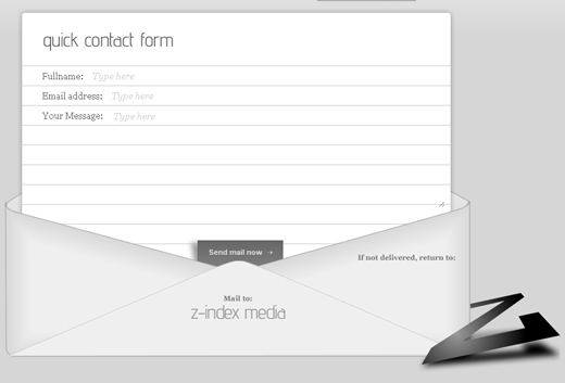
Be Helpful Along the way: Since the contact form is supposed to be used by everyone around, from spammers to genuine customers, you need to be as helpful as possible in the process. To simplify the steps, you need to make it clear to the visitors what you need in a given field and why you need it. Use ghost text in the blank fields to make it easier for people to understand what information they are supposed to put. Use Ghost Texts as a mean to give a hint to user about the formatting they are supposed to use in a given field. For say, majority of cases, different people use different date format and this can create confusion. To cut down on the confusion, you need to use Ghost Texts to instruct the visitors about what formatting is acceptable and what is not.
Cut Down on Friction: By reducing frictions, you will be able to see major improvement in the number of confusion. I hate those sites that place Submit and Cancel buttons side by side. Just feel the pain of the user who completes the form precisely and then clicks the wrong button and all his hard work goes wasted. The same thing happens when you are not specific about what is acceptable and what is not acceptable in a given field. Users after submitting the form will realize that they have fill out it the wrong way and that means they will have to go through the entire process again. This is frustrating a lot, Make it simple by cutting down on these frictions and you will have a better world to live.
Michael Evans is a passionate writer and he write for insidershostreview.com where you can find impartial iPage Review.


